Performance and Prediction
Model Performance
This section describes how H2O-3 can be used to evaluate model performance through model metrics, stopping metrics, and performance graphs.
Evaluation Model Metrics
H2O-3 provides a variety of metrics that can be used for evaluating supervised and unsupervised models. The metrics for this section only cover supervised learning models, which vary based on the model type (classification or regression).
Regression
The following evaluation metrics are available for regression models:
- R2 (R Squared)
- MSE (Mean Squared Error)
- RMSE (Root Mean Squared Error)
- RMSLE (Root Mean Squared Logarithmic Error)
- MAE (Mean Absolute Error)
R2 (R Squared)
The R2 value represents the degree that the predicted value and the actual value move in unison. The R2 value varies between 0 and 1 where 0 represents no correlation between the predicted and actual value and 1 represents complete correlation.
MSE (Mean Squared Error)
The MSE metric measures the average of the squares of the errors or deviations. MSE takes the distances from the points to the regression line (these distances are the “errors”) and squaring them to remove any negative signs. MSE incorporates both the variance and the bias of the predictor.
MSE also gives more weight to larger differences. The bigger the error, the more it is penalized. For example, if your correct answers are 2,3,4 and the algorithm guesses 1,4,3, then the absolute error on each one is exactly 1, so squared error is also 1, and the MSE is 1. But if the algorithm guesses 2,3,6, then the errors are 0,0,2, the squared errors are 0,0,4, and the MSE is a higher 1.333. The smaller the MSE, the better the model’s performance. (Tip: MSE is sensitive to outliers. If you want a more robust metric, try mean absolute error (MAE).)
MSE equation:
\[MSE = \frac{1}{N} \sum_{i=1}^{N}(y_i -\hat{y}_i)^2\]
RMSE (Root Mean Squared Error)
The RMSE metric evaluates how well a model can predict a continuous value. The RMSE units are the same as the predicted target, which is useful for understanding if the size of the error is of concern or not. The smaller the RMSE, the better the model’s performance. (Tip: RMSE is sensitive to outliers. If you want a more robust metric, try mean absolute error (MAE).)
RMSE equation:
\[RMSE = \sqrt{\frac{1}{N} \sum_{i=1}^{N}(y_i -\hat{y}_i)^2 }\]
Where:
- N is the total number of rows (observations) of your corresponding dataframe.
- y is the actual target value.
- \(\hat{y}\) is the predicted target value.
RMSLE (Root Mean Squared Logarithmic Error)
This metric measures the ratio between actual values and predicted values and takes the log of the predictions and actual values. Use this instead of RMSE if an under-prediction is worse than an over-prediction. You can also use this when you don’t want to penalize large differences when both of the values are large numbers.
RMSLE equation:
\[RMSLE = \sqrt{\frac{1}{N} \sum_{i=1}^{N} \big(ln \big(\frac{y_i +1} {\hat{y}_i +1}\big)\big)^2 }\]
Where:
- N is the total number of rows (observations) of your corresponding dataframe.
- y is the actual target value.
- \(\hat{y}\) is the predicted target value.
MAE (Mean Absolute Error)
The mean absolute error is an average of the absolute errors. The MAE units are the same as the predicted target, which is useful for understanding whether the size of the error is of concern or not. The smaller the MAE the better the model’s performance. (Tip: MAE is robust to outliers. If you want a metric that is sensitive to outliers, try root mean squared error (RMSE).)
MAE equation:
\[MAE = \frac{1}{N} \sum_{i=1}^{N} | x_i - x |\]
Where:
- N is the total number of errors
- \(| x_i - x |\) equals the absolute errors.
Classification
The following evaluation metrics are available for classification models:
- Gini Coefficient
- Absolute MCC (Matthews Correlation Coefficient)
- F1
- F0.5
- F2
- Accuracy
- Logloss
- AUC (Area Under the ROC Curve)
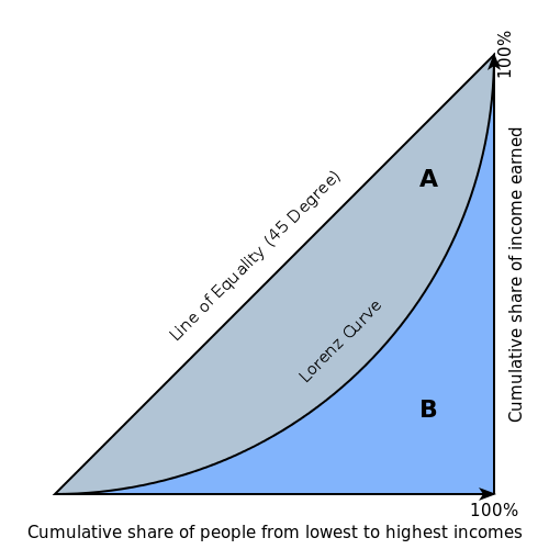
Gini Coefficient
The Gini index is a well-established method to quantify the inequality among values of a frequency distribution, and can be used to measure the quality of a binary classifier. A Gini index of zero expresses perfect equality (or a totally useless classifier), while a Gini index of one expresses maximal inequality (or a perfect classifier).
The Gini index is based on the Lorenz curve. The Lorenz curve plots the true positive rate (y-axis) as a function of percentiles of the population (x-axis).
The Lorenz curve represents a collective of models represented by the classifier. The location on the curve is given by the probability threshold of a particular model. (i.e., Lower probability thresholds for classification typically lead to more true positives, but also to more false positives.)
The Gini index itself is independent of the model and only depends on the Lorenz curve determined by the distribution of the scores (or probabilities) obtained from the classifier.
Absolute MCC (Matthews Correlation Coefficient)
Setting the absolute_mcc parameter sets the threshold for the model’s confusion matrix to a value that generates the highest Matthews Correlation Coefficient. The MCC score provides a measure of how well a binary classifier detects true and false positives, and true and false negatives. The MCC is called a correlation coefficient because it indicates how correlated the actual and predicted values are; 1 indicates a perfect classifier, -1 indicates a classifier that predicts the opposite class from the actual value, and 0 means the classifier does no better than random guessing.
F1
The F1 score provides a measure for how well a binary classifier can classify positive cases (given a threshold value). The F1 score is calculated from the harmonic mean of the precision and recall. An F1 score of 1 means both precision and recall are perfect and the model correctly identified all the positive cases and didn’t mark a negative case as a positive case. If either precision or recall are very low it will be reflected with a F1 score closer to 0.
Where:
- precision is the positive observations (true positives) the model correctly identified from all the observations it labeled as positive (the true positives + the false positives).
- recall is the positive observations (true positives) the model correctly identified from all the actual positive cases (the true positives + the false negatives).
F0.5
The F0.5 score is the weighted harmonic mean of the precision and recall (given a threshold value). Unlike the F1 score, which gives equal weight to precision and recall, the F0.5 score gives more weight to precision than to recall. More weight should be given to precision for cases where False Positives are considered worse than False Negatives. For example, if your use case is to predict which products you will run out of, you may consider False Positives worse than False Negatives. In this case, you want your predictions to be very precise and only capture the products that will definitely run out. If you predict a product will need to be restocked when it actually doesn’t, you incur cost by having purchased more inventory than you actually need.
F0.5 equation:
\[F0.5 = 1.25 \;\Big(\; \frac{(precision) \; (recall)}{0.25 \; precision + recall}\; \Big)\]
Where:
- precision is the positive observations (true positives) the model correctly identified from all the observations it labeled as positive (the true positives + the false positives).
- recall is the positive observations (true positives) the model correctly identified from all the actual positive cases (the true positives + the false negatives).
F2
The F2 score is the weighted harmonic mean of the precision and recall (given a threshold value). Unlike the F1 score, which gives equal weight to precision and recall, the F2 score gives more weight to recall (penalizing the model more for false negatives then false positives). An F2 score ranges from 0 to 1, with 1 being a perfect model.
Accuracy
In binary classification, Accuracy is the number of correct predictions made as a ratio of all predictions made. In multiclass classification, the set of labels predicted for a sample must exactly match the corresponding set of labels in y_true.
Accuracy equation:
\[Accuracy = \Big(\; \frac{\text{number correctly predicted}}{\text{number of observations}}\; \Big)\]
Logloss
The logarithmic loss metric can be used to evaluate the performance of a binomial or multinomial classifier. Unlike AUC which looks at how well a model can classify a binary target, logloss evaluates how close a model’s predicted values (uncalibrated probability estimates) are to the actual target value. For example, does a model tend to assign a high predicted value like .80 for the positive class, or does it show a poor ability to recognize the positive class and assign a lower predicted value like .50? Logloss ranges between 0 and 1, with 0 meaning that the model correctly assigns a probability of 0% or 100%.
Binary classification equation:
\[Logloss = - \;\frac{1}{N} \sum_{i=1}^{N}w_i(\;y_i \ln(p_i)+(1-y_i)\ln(1-p_i)\;)\]
Multiclass classification equation:
\[Logloss = - \;\frac{1}{N} \sum_{i=1}^{N}\sum_{j=1}^{C}w_i(\;y_i,_j \; \ln(p_i,_j)\;)\]
Where:
- N is the total number of rows (observations) of your corresponding dataframe.
- w is the per row user-defined weight (defaults is 1).
- C is the total number of classes (C=2 for binary classification).
- p is the predicted value (uncalibrated probability) assigned to a given row (observation).
- y is the actual target value.
AUC (Area Under the ROC Curve)
This model metric is used to evaluate how well a binary classification model is able to distinguish between true positives and false positives. An AUC of 1 indicates a perfect classifier, while an AUC of .5 indicates a poor classifier, whose performance is no better than random guessing. H2O uses the trapezoidal rule to approximate the area under the ROC curve.
H2O uses the trapezoidal rule to approximate the area under the ROC curve. (Tip: AUC is usually not the best metric for an imbalanced binary target because a high number of True Negatives can cause the AUC to look inflated. For an imbalanced binary target, we recommend AUCPR or MCC.)
Metric Best Practices - Regression
When deciding which metric to use in a regression problem, some main questions to ask are:
- Do you want your metric sensitive to outliers?
- What unit should the metric be in?
Sensitive to Outliers
Certain metrics are more sensitive to outliers. When a metric is sensitive to outliers, it means that it is important that the model predictions are never “very” wrong. For example, let’s say we have an experiment predicting number of days until an event. The graph below shows the absolute error in our predictions.
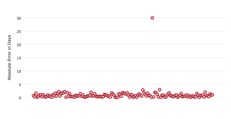
Usually our model is very good. We have an absolute error less than 1 day about 70% of the time. There is one instance, however, where our model did very poorly. We have one prediction that was 30 days off.
Instances like this will more heavily penalize metrics that are sensitive to outliers. If you do not care about these outliers in poor performance as long as you typically have a very accurate prediction, then you would want to select a metric that is robust to outliers. You can see this reflected in the behavior of the metrics: MSE and RMSE.
| MSE | RMSE | |
|---|---|---|
| Outlier | 0.99 | 2.64 |
| No Outlier | 0.80 | 1.0 |
Calculating the RMSE and MSE on our error data, the RMSE is more than twice as large as the MSE because RMSE is sensitive to outliers. If you remove the one outlier record from our calculation, RMSE drops down significantly.
Performance Units
Different metrics will show the performance of your model in different units. Let’s continue with our example where our target is to predict the number of days until an event. Some possible performance units are:
- Same as target: The unit of the metric is in days
- ex: MAE = 5 means the model predictions are off by 5 days on average
- Percent of target: The unit of the metric is the percent of days
- ex: MAPE = 10% means the model predictions are off by 10 percent on average
- Square of target: The unit of the metric is in days squared
- ex: MSE = 25 means the model predictions are off by 5 days on average (square root of 25 = 5)
Comparison
| Metric | Units | Sensitive to Outliers | Tip |
|---|---|---|---|
| R2 | scaled between 0 and 1 | No | use when you want performance scaled between 0 and 1 |
| MSE | square of target | Yes | |
| RMSE | same as target | Yes | |
| RMSLE | log of target | Yes | |
| RMSPE | percent of target | Yes | use when target values are across different scales target values are across differ ent scales |
| MAE | same as target | No | |
| MAPE | percent of target | No | use when target values are across different scales |
| SMAPE | percent of target divided by 2 | No | use when target values are close to 0 |
Metric Best Practices - Classification
When deciding which metric to use in a classification problem some main questions to ask are:
- Do you want the metric to evaluate the predicted probabilities or the classes that those probabilities can be converted to?
- Is your data imbalanced?
Does the Metric Evaluate Probabilities or Classes?
The final output of a model is a predicted probability that a record is in a particular class. The metric you choose will either evaluate how accurate the probability is or how accurate the assigned class is from that probability.
Choosing this depends on the use of the model. Do you want to use the probabilities, or do you want to convert those probabilities into classes? For example, if you are predicting whether a customer will churn, you can take the predicted probabilities and turn them into classes - customers who will churn vs customers who won’t churn. If you are predicting the expected loss of revenue, you will instead use the predicted probabilities (predicted probability of churn * value of customer).
If your use case requires a class assigned to each record, you will want to select a metric that evaluates the model’s performance based on how well it classifies the records. If your use case will use the probabilities, you will want to select a metric that evaluates the model’s performance based on the predicted probability.
Is the Metric Robust to Imbalanced Data?
For certain use cases, positive classes may be very rare. In these instances, some metrics can be misleading. For example, if you have a use case where 99% of the records have Class = No, then a model that always predicts No will have 99% accuracy.
For these use cases, it is best to select a metric that does not include True Negatives or considers relative size of the True Negatives like AUCPR or MCC.
Metric Comparison
| Metric | Evaluation Based On | Tip |
|---|---|---|
| MCC | Class | good for imbalanced data |
| F1 | Class | |
| F0.5 | Class | good when you want to give more weight to precision |
| F2 | Class | good when you want to give more weight to recall |
| Accuracy | Class | highly interpretable |
| Logloss | Probability | |
| AUC | Class | |
| AUCPR | Class | good for imbalanced data |
Stopping Model Metrics
Stopping metric parameters are specified in conjunction with a stopping tolerance and a number of stopping rounds. A metric specified with the stopping_metric option specifies the metric to consider when early stopping is specified.
Misclassification
This parameter specifies that a model must improve its misclassification rate by a given amount (specified by the stopping_tolerance parameter) in order to continue iterating. The misclassification rate is the number of observations incorrectly classified divided by the total number of observations.
Lift Top Group
This parameter specifies that a model must improve its lift within the top 1% of the training data. To calculate the lift, H2O sorts each observation from highest to lowest predicted value. The top group or top 1% corresponds to the observations with the highest predicted values. Lift is the ratio of correctly classified positive observations (rows with a positive target) to the total number of positive observations within a group.
Deviance
The model will stop building if the deviance fails to continue to improve. Deviance is computed as follows:
Loss = Quadratic -> MSE==Deviance For Absolute/Laplace or Huber -> MSE != Deviance
Mean-Per-Class-Error
The model will stop building after the mean-per-class error rate fails to improve.
In addition to the above options, Logloss, MSE, RMSE, MAE, RMSLE, and AUC can also be used as the stopping metric.
Model Performance Graphs
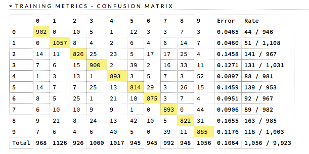
Confusion Matrix
A confusion matrix is a table depicting performance of algorithm in terms of false positives, false negatives, true positives, and true negatives. In H2O, the actual results display in the columns and the predictions display in the rows; correct predictions are highlighted in yellow. In the example below, 0 was predicted correctly 902 times, while 8 was predicted correctly 822 times and 0 was predicted as 4 once.
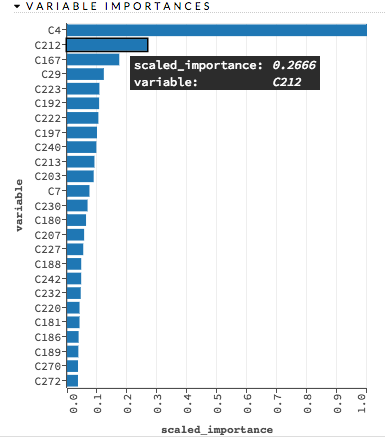
Variable Importances
Variable importances represent the statistical significance of each variable in the data in terms of its affect on the model. Variables are listed in order of most to least importance. The percentage values represent the percentage of importance across all variables, scaled to 100%. The method of computing each variable’s importance depends on the algorithm. More information is available in the Variable Importance section.
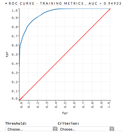
ROC Curve
A ROC Curve is a graph that represents the ratio of true positives to false positives. (For more information, refer to the Linear Digressions podcast describing ROC Curves.) To view a specific threshold, select a value from the drop-down Threshold list. To view any of the following details, select it from the drop-down Criterion list:
- Max f1
- Max f2
- Max f0point5
- Max accuracy
- Max precision
- Max absolute MCC (the threshold that maximizes the absolute Matthew’s Correlation Coefficient)
- Max min per class accuracy
The lower-left side of the graph represents less tolerance for false positives while the upper-right represents more tolerance for false positives. Ideally, a highly accurate ROC resembles the following example.
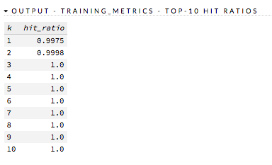
Hit Ratio
The hit ratio is a table representing the number of times that the prediction was correct out of the total number of predictions.
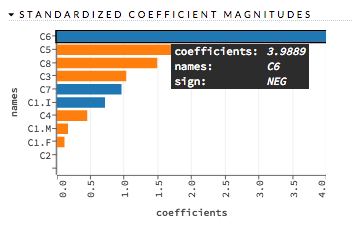
Standardized Coefficient Magnitudes
This chart represents the relationship of a specific feature to the response variable. Coefficients can be positive (orange) or negative (blue). A positive coefficient indicates a positive relationship between the feature and the response, where an increase in the feature corresponds with an increase in the response, while a negative coefficient represents a negative relationship between the feature and the response where an increase in the feature corresponds with a decrease in the response (or vice versa).
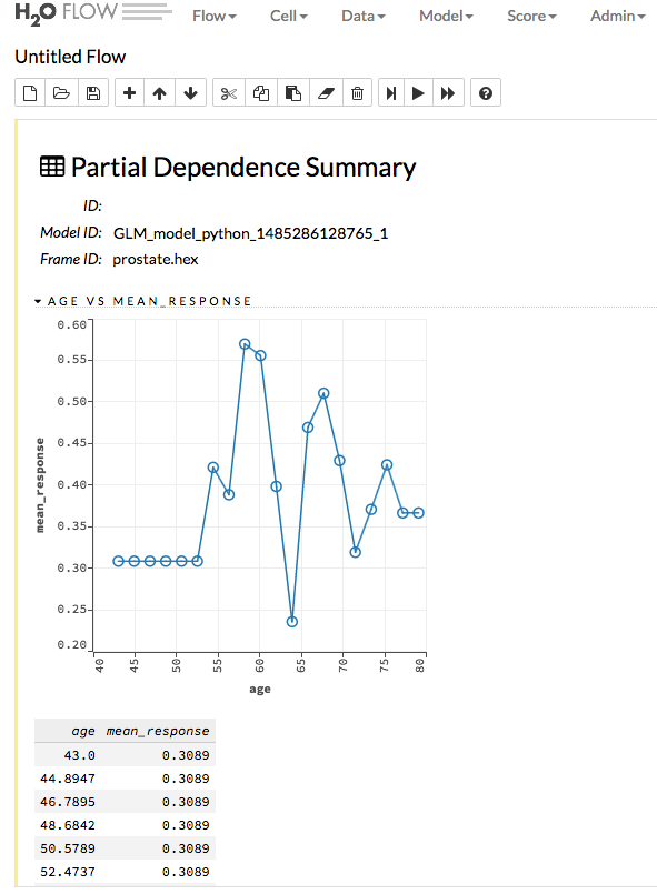
Partial Dependence Plots
This plot provides a graphical representation of the marginal effect of a variable on the class probability (classification) or response (regression). Note that this is only available for models that include only numerical values.
The partial dependence of a given feature \(X_j\) is the average of the response function \(g\), where all the components of \(X_j\) are set to \(x_j\) \((X_j = {[x{^{(0)}_j},...,x{^{(N-1)}_j}]}^T)\)
Thus, the one-dimensional partial dependence of function \(g\) on \(X_j\) is the marginal expectation:
Notes:
- The partial dependence of a given feature is \(Xj\) (where \(j\) is the column index)
- You can also change the equation to sum from 1 to N instead of 0 to N-1
Prediction
With H2O-3, you can generate predictions for a model based on samples in a test set using h2o.predict() or predict(). This can be accomplished in memory or using MOJOs/POJOs.
Note: MOJO/POJO predict cannot parse columns enclosed in double quotes (for example, “”2”“).
For classification problems, predicted probabilities and labels are compared against known results. (Note that for binary models, labels are based on the maximum F1 threshold from the model object.) For regression problems, predicted regression targets are compared against testing targets and typical error metrics.
Predicting Leaf Node Assignment
For tree-based models, including GBM, DRF, XGBoost, and Isolation Forest, the h2o.predict_leaf_node_assignment() function predicts the leaf assignment on an H2O model.
This function predicts against a test frame. For every row in the test frame, this function returns the leaf placements of the row in all the trees in the model. An optional Type can also be specified to define the placements. Placements can be represented either by paths to the leaf nodes from the tree root (Path - default) or by H2O’s internal identifiers (Node_ID). The order of the rows in the results is the same as the order in which the data was loaded.
This function returns an H2OFrame object with categorical leaf assignment identifiers for each tree in the model.
Prediction Threshold
For classification problems, when running h2o.predict() or .predict(), the prediction threshold is selected as follows:
- If you train a model with only training data, the Max F1 threshold from the train data model metrics is used.
- If you train a model with train and validation data, the Max F1 threshold from the validation data model metrics is used.
- If you train a model with train data and set the
nfoldparameter, the Max F1 threshold from the training data model metrics is used. - If you train a model with the train data and validation data and also set the
nfold parameter, the Max F1 threshold from the validation data model metrics is used.
In-Memory Prediction
This section provides examples of performing predictions in Python and R. Refer to the Predictions topic in the Flow chapter to view an example of how to predict in Flow.
library(h2o)
h2o.init()

# Import the prostate dataset
prostate.hex <- h2o.importFile(path = "https://raw.github.com/h2oai/h2o/master/smalldata/logreg/prostate.csv",
                               destination_frame = "prostate.hex")

# Split dataset giving the training dataset 75% of the data
prostate.split <- h2o.splitFrame(data=prostate.hex, ratios=0.75)

# Create a training set from the 1st dataset in the split
prostate.train <- prostate.split[[1]]

# Create a testing set from the 2nd dataset in the split
prostate.test <- prostate.split[[2]]

# Convert the response column to a factor
prostate.train$CAPSULE <- as.factor(prostate.train$CAPSULE)

# Build a GBM model
model <- h2o.gbm(y="CAPSULE",
                 x=c("AGE", "RACE", "PSA", "GLEASON"),
                 training_frame=prostate.train,
                 distribution="bernoulli",
                 ntrees=100,
                 max_depth=4,
                 learn_rate=0.1)

# Predict using the GBM model and the testing dataset
pred <- h2o.predict(object=model, newdata=prostate.test)
pred
  predict         p0          p1
1       0 0.7414373 0.25856274
2       1 0.3114293 0.68857073
3       0 0.9852284 0.01477161
4       0 0.6647902 0.33520975
5       0 0.6075046 0.39249538
6       1 0.4065468 0.59345323

[88 rows x 3 columns]

# View a summary of the prediction with a probability of TRUE
summary(pred$p1, exact_quantiles=TRUE)
 p1
 Min.   :0.008925
 1st Qu.:0.160050
 Median :0.350236
 Mean   :0.451507
 3rd Qu.:0.818486
 Max.   :0.99040

# Predict the leaf node assigment using the GBM model and test data.
# Predict based on the path from the root node of the tree.
predict_lna <- h2o.predict_leaf_node_assignment(model, prostate.test)

# View a summary of the leaf node assignment prediction
summary(predict_lna$T1.C1, exact_quantiles=TRUE)
T1.C1
RRLR:15
RRR :13
LLLR:12
LLLL:11
LLRR: 8
LLRL: 6
import h2o
from h2o.estimators.gbm import H2OGradientBoostingEstimator
h2o.init()

# Import the prostate dataset
h2o_df = h2o.import_file("https://raw.github.com/h2oai/h2o/master/smalldata/logreg/prostate.csv")

# Split the data into Train/Test/Validation with Train having 70% and test and validation 15% each
train,test,valid = h2o_df.split_frame(ratios=[.7, .15])

# Convert the response column to a factor
h2o_df["CAPSULE"] = h2o_df["CAPSULE"].asfactor()

# Generate a GBM model using the training dataset
model = H2OGradientBoostingEstimator(distribution="bernoulli",
                                     ntrees=100,
                                     max_depth=4,
                                     learn_rate=0.1)
model.train(y="CAPSULE", x=["AGE","RACE","PSA","GLEASON"],training_frame=h2o_df)

# Predict using the GBM model and the testing dataset
predict = model.predict(test)

# View a summary of the prediction
predict.head()
predict        p0        p1
---------  --------  --------
        0  0.8993    0.1007
        1  0.168391  0.831609
        1  0.166067  0.833933
        1  0.327212  0.672788
        1  0.25991   0.74009
        0  0.758978  0.241022
        0  0.540797  0.459203
        0  0.838489  0.161511
        0  0.704853  0.295147
        0  0.642381  0.357619

[10 rows x 3 columns]

# Predict the leaf node assigment using the GBM model and test data.
# Predict based on the path from the root node of the tree.
predict_lna = model.predict_leaf_node_assignment(test, "Path")
Predict using MOJOs
An end-to-end example from building a model through predictions using MOJOs is available in the MOJO Quick Start topic.
Predict using POJOs
An end-to-end example from building a model through predictions using POJOs is available in the POJO Quick Start topic.